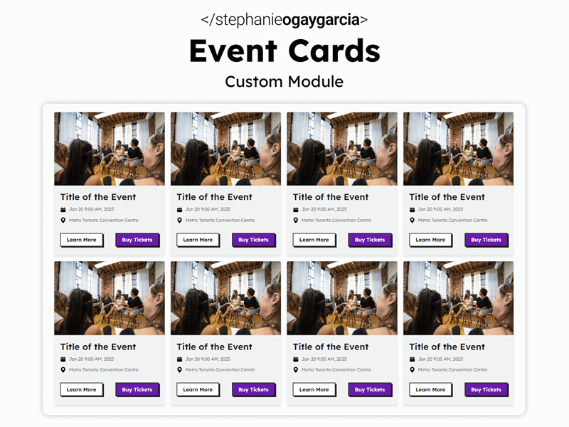
The HubSpot Event Cards Module
Features:
- Can be used on any HubSpot website. Automatically adapts to the styling of any HubSpot Theme you're using, whether it's from the Marketplace or custom built.
- Supports Schema/Structured Data. Enable this feature to provide search engines with extra data which may help your events appear as rich results. The module uses the Event structured data.
- Highly Customizable. Don't like the default styling? Customize it! Read below for more details on all the customization options available.
Module Live Demo
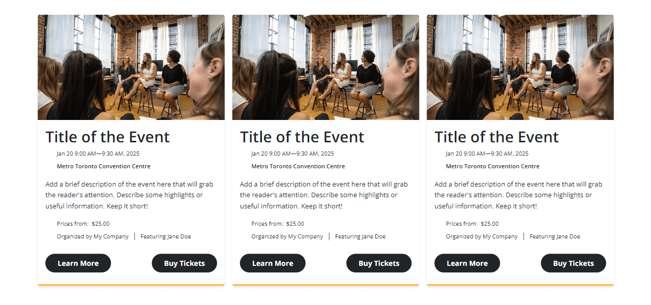
The Event Cards module can be added to any HubSpot theme and will automatically adapt to your website's styling. Below is a live example of what the module first looks like when added to this particular theme.

Metro Toronto Convention Centre


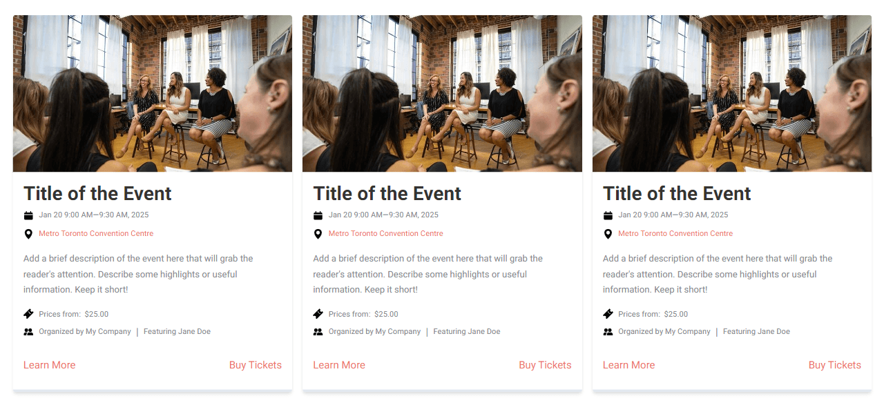
Adapts to any HubSpot Theme
Below are some examples of what the module first looks like when used on other themes.
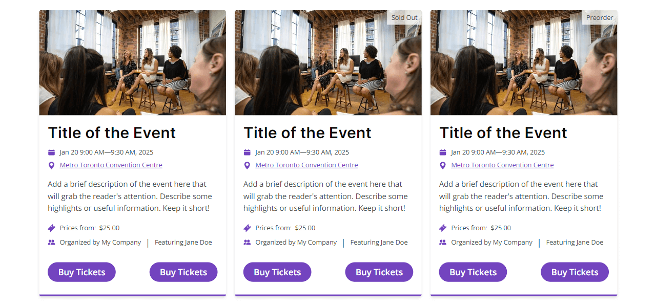
Simple Grid
The example below uses the basic fields, adds a background colour to the cards and styles each button differently.






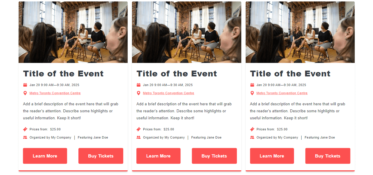
Minimalist Grid
The example below uses the basic fields, adds a background colour to the cards and styles each button differently.
Configuration Options
Below is a list of all the customization options available for the Event Cards module.
Content:
- Events (repeater, add as many as you need!)
- Image
- Image (image)
- Title
- Title (text)
- Date and Time
- Start Date (date and time)
- End Date (date and time)
- Status (choice)
- Location
- Attendance Mode (choice)
- Venue Location
- Name (text)
- Address (text)
- City (text)
- Postal Code/Zip Code (text)
- Province/State/Country (text)
- Country (text)
- Directions (URL)
- Online Location
- Name (text)
- URL (URL)
- Description
- Description (rich text)
- Tickets
- Type (choice)
- Availability (choice)
- Label (text)
- Prices (number)
- Currency (text)
- On Sale Date (date and time)
- Purchase URL (URL)
- Sold Out Label (text)
- Preorder Label (text)
- Organizer
- Label (text)
- Name (text)
- URL (URL)
- Performer(s)
- Label (text)
- Performers
- Type (choice)
- Name (text)
- Buttons
- Buttons
- Text (text)
- Link (link)
- Buttons
- Link
- Link (link)
- Image
- Schema/Structured Data
- Enable Schema (boolean)
- Advanced
- Custom CSS Class (text)
- Custom CSS (text)
Styles:
- Display Settings
- Display Image
- Display Date
- Display Location
- Display Description
- Display Ticket Prices
- Display Organizer
- Display Performer(s)
- Layout
- Cards Per Row (Large Screens ≥992px)
- Cards Per Row (Medium Screens ≥768px)
- Cards Per Row (Small Screens <768px)
- Cards
- Background
- Color
- Border
- Border
- Corner
- Radius
- Shadow
- V-Offset
- H-Offset
- Blur
- Spread
- Color
- Spacing
- Padding
- Background
- Image
- Corner
- Radius
- Size
- Aspect Ratio
- Corner
- Title
- Text
- Heading Level
- Font
- Text
- Date and Time
- Text
- Font
- Text
- Location
- Text
- Font
- Color (On Hover)
- Text
- Description
- Text
- Font
- Text
- Tickets
- Label
- Text
- Font
- Text
- Text
- Font
- Banner
- Background
- Color
- Text
- Font
- Background
- Label
- Organizer
- Label
- Text
- Font
- Text
- Text
- Font
- Label
- Performer(s)
- Label
- Text
- Font
- Text
- Text
- Font
- Label
- Buttons
- Alignment
- Alignment
- Button One
- Text
- Font
- Color (On Hover)
- Background
- Color
- Color (On Hover)
- Border
- Border
- Color (On Hover)
- Corner
- Radius
- Spacing
- Spacing
- Text
- Button Two
- Text
- Font
- Color (On Hover)
- Background
- Color
- Color (On Hover)
- Border
- Border
- Color (On Hover)
- Corner
- Radius
- Spacing
- Spacing
- Text
- Alignment
- Icons
- Fill
- Color
- Size
- Height
- Fill
